Everything Carts
B2C e-commerce website responsive redesign.

B2C e-commerce website responsive redesign.
A few weeks before Google’s deadline for mobile-first indexing, leadership pushed the e-commerce team to update two of our non-responsive websites to responsive templates. I quickly assembled mock-ups and worked with the platform developer to create a new dev environment for the new responsive template. I was able to implement the new template before the two-week deadline. With the new template, we saw an increase in mobile conversions for the first time in the website’s history, plus the website passed Google’s mobile-first indexing and had high Lighthouse scores.
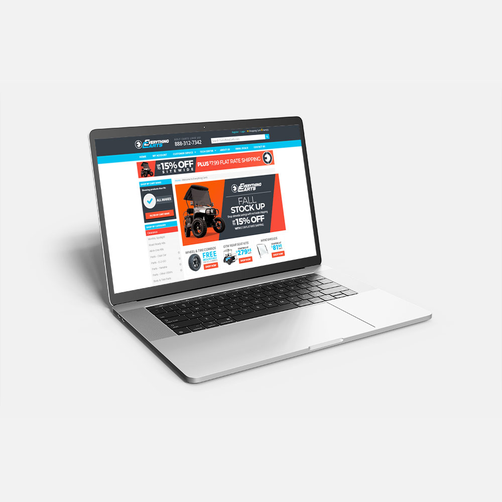
The eCommerce team had a few weeks to update two websites before Google introduced its mobile-first indexing. We were given two weeks to update Everything Carts’ and another B2C website’s non-responsive templates. While we had assistance with the development environment and developing the updates, we had only three designers on the internal team to manage these two projects and other daily tasks. The new template was responsive, but the account, cart, and checkout sections still used tables for their layouts, which caused some issues with making those sections fully responsive.
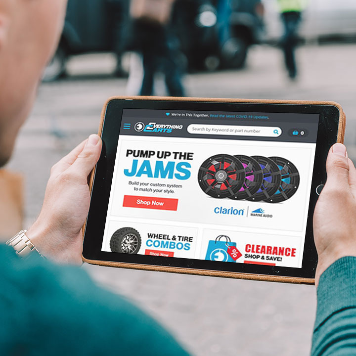
I could create mock-ups for both websites and, luckily, hand off the designs for the other website to that platform’s developer and our two junior web designers while I focused on Everything Carts. The platform had a barebones Bootstrap 3 template I could utilize to help save some time. I also created new banner templates to hand off to the marketing team.
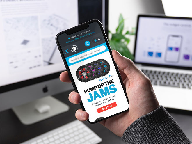
We met the two-week deadline, resulting in increased mobile conversions and passing Google’s mobile-first indexing. Additionally, our legacy website achieved almost perfect Lighthouse scores.
